The floating shelf above the kitchen worktop holds four objects: a stack of three blue-and-white plates, a brass candleholder, a single eucalyptus stem in a small ceramic bottle, and a hardback book about Roman cooking that I've been working through. The shelf is 90cm long. It has not been re-styled in fourteen months. It reads better now than it did the day I installed it because the objects have softened into the arrangement.
The floating shelf became a styling cliché — the "shelfie" — through over-decoration. The image-search results show shelves crammed with twelve objects per running foot, each carefully placed, photographed at 4pm with a single beam of light. None of these shelves look like that in person at 7pm with the lamps on. The cosy version is much smaller.
From the same corner of the site: Textile Layering Guide, How Do You Decorate Shelves by Room, and Warm Kitchen Design Ideas Without Going Full.
A floating shelf can read like a considered still life or a cluttered ledge — the difference is how it's styled. These twelve ideas cover what to put on a shelf, how to arrange it, and how to keep it from looking either bare or crammed. Pick the approach that suits your shelf and the room it's in.
1. Mix the Three Categories of Object
Every well-styled shelf combines three kinds of thing: something to read (books), something living (a plant or cut stems), and something sculptural (a ceramic, a bowl, an object). Group them in odd numbers and the shelf reads as a considered still life rather than a row of stuff. The mix is the formula.
2. Stack Books Flat and Upright
Vary how the books sit: some standing upright between bookends, some stacked flat in a short pile with an object on top. The flat stack doubles as a riser for a small ceramic or a plant, adding height variation. All-upright reads like a library shelf; the mix reads styled.
3. Leave a Third of the Shelf Empty
The hardest discipline in shelf styling is restraint. Aim to leave roughly a third of the shelf as negative space, so the styled groupings have room to breathe. A shelf packed end to end reads as storage; a shelf with deliberate gaps reads as a composition. The empty space is doing the work.
4. Layer Front to Back
Depth makes a shelf look professional. Lean a piece of art or a framed photo at the back, place taller objects behind shorter ones, and let a couple of things sit at the very front edge. The front-to-back layering gives the shelf dimension a single flat row can't achieve.
5. Lean Art Instead of Hanging It
Propping a framed print or a small piece of art against the wall on the shelf reads more relaxed than hanging, and lets you layer objects in front of it. It's also endlessly rearrangeable — swap the art with the season or the mood without a single nail. Casual, layered, and flexible.
6. Add One Plant or Trailing Green
Something living stops a shelf feeling static. A small potted plant, a trailing pothos spilling over the edge, or a few cut stems in a bud vase brings life and a soft organic line to the hard horizontal. The trailing green softening the shelf's edge is a small move with outsized effect.
7. Keep a Tight Colour Palette
A shelf reads calm and considered when its objects share a tight palette — warm neutrals, natural materials, a single accent repeated. A jumble of colours reads as clutter however well arranged. Edit the objects to a coherent palette and even a busy shelf looks intentional.
8. Vary the Heights Deliberately
A styled shelf has a rhythm of high and low — a tall vase or leaned artwork, a medium stack of books, a low bowl or object. The varied skyline keeps the eye moving and stops the shelf reading flat. Use book stacks as risers to lift small objects into the right height.
9. Run Two Shelves and Relate Them
With a pair of floating shelves, style them as a related composition rather than two separate rows — let a tall object on the lower shelf rise into the gap, balance a heavy grouping on one shelf against a lighter one diagonally opposite. The two shelves should read as one designed wall.
10. Add Soft Lighting Under or Behind
A warm LED strip tucked under the front lip of a shelf, or a small lamp on the shelf itself, makes the display glow in the evening and turns functional storage into a styling moment. The light is part-storage, part-styling, and entirely cosy after dark.
11. Style Kitchen Shelves With Everyday Things
Open kitchen shelves read warm when styled with the things you actually use — stacked plates, lined-up mugs, a few glasses, a leaned board, a small plant. The slight imperfection of real, used items reads more inviting than a showroom arrangement. Function and styling in the same shelf.
12. Refresh It With the Seasons
A styled shelf isn't permanent. Swap a few objects with the seasons — branches and warm tones in autumn, stems and lighter pieces in spring — to keep the display alive and the room feeling current. A leaned-art-and-objects shelf is built for exactly this kind of low-effort seasonal refresh.
The Method Behind Styling a Shelf
The ideas above are the menu; the principles below are the rules — the three categories of object, the layering, and the negative space that turn a shelf from storage into a styled composition.
The Three Categories of Shelf Object
A working shelf uses three types of objects in deliberate balance:
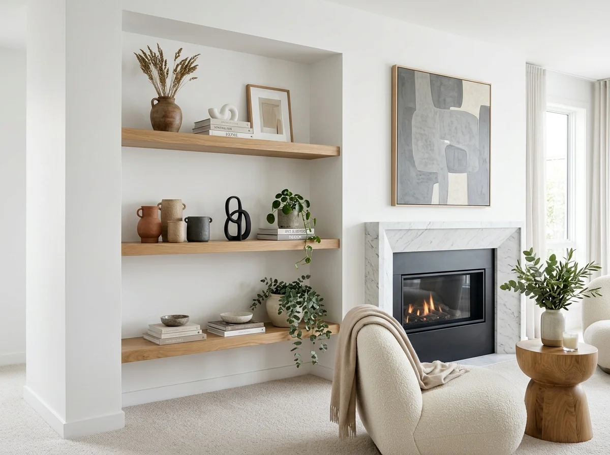
Vertical anchors. Tall objects that draw the eye upward. A vase with a single tall branch, a stack of three books standing upright, a tall candlestick. One per shelf, placed off-centre.
Horizontal anchors. Wide objects that ground the arrangement. A small framed work leaning against the wall, a wide ceramic bowl, a long brass tray. One or two per shelf.
Small accents. Small objects that fill the space between anchors. A single ceramic, a small candle, a folded textile, a single piece of fruit. Two to four per shelf.
The ratio per shelf: one vertical anchor, one horizontal anchor, two to four small accents. Total: four to six objects per shelf at standard 90cm-1.2m length.
Vary the Heights
The eye reads variation in height as composition. A shelf where every object is roughly the same height (medium-size objects all in a row) reads as a row of objects rather than as an arrangement.
The heights should span a wide range relative to the shelf:
- One object near the maximum height the shelf can take (30-50cm tall)
- One or two medium objects (15-25cm tall)
- One or two small objects (5-12cm tall)
This is the same principle as a tablescape — the height variation creates visual rhythm.
Stacks of Books Are Underrated
Three books stacked horizontally on a shelf serve as a horizontal anchor with very little effort. The book stack can be:
- Vintage hardback books with similar spines (cloth-bound, faded colours)
- Large-format art or photography books used as visual weight
- A working stack — books you're actually reading, swapped in and out
A stack of three books with a small object on top (a small ceramic, a brass paperweight, a curve of beach stone) creates a vignette in itself. This is the easiest cosy shelf component.
Vertical book stacks (books standing upright with bookends or against a wall) also work. The arrangement reads more library-like and slightly more formal than horizontal stacks.
Lean Things, Don't Hang Them
The wall behind a floating shelf doesn't need its own art. The art leans against the wall, on the shelf itself.
A small framed work — 25-35cm tall — leaning back against the wall, with smaller objects in front of it. The leaning art creates the horizontal anchor and adds visual depth without committing to a permanent hanging position.
Multiple small framed works can lean overlapping each other, creating a salon-style arrangement on the shelf itself. Vary the frames as you would in a wall gallery (mixed finishes, mixed sizes, consistent matting).
Spacing and Breathing Room
The most common shelf-styling mistake is filling every inch. The cosy version has visible empty space between groupings.
The working pattern: cluster two or three objects together at one end of the shelf, leave 20-30cm of empty space, cluster two or three more at the other end. The empty space reads as intentional rather than as lazy styling.
For longer shelves (1.5m+), three groupings work better than two — one near each end and one slightly off-centre in the middle.
The empty space between groupings on a shelf reads as composed. Filling every inch reads as cluttered.
The Material Mix
Within the small number of objects on a shelf, mix materials. The shelf reads as still-life when the objects come from different material categories:
- Ceramic (glazed or unglazed)
- Brass or other metal
- Glass (clear or coloured)
- Paper or fabric (books, framed prints, folded textiles)
- Organic (fresh foliage, dried botanicals, fruit)
- Wood (small carved or turned objects)
A shelf with four objects across four different materials reads richer than a shelf with eight objects all in ceramic.
What to Skip on a Floating Shelf
Trinkets and souvenir-shop objects. Resin figurines, miniature decorative items, items with sayings printed on them. None of these earn a shelf position.
Plastic plants and faux greenery. Real foliage in season, or no foliage. Faux always reads as plastic.
Photo frames as filler. A floating shelf is not the right place for photographs. Frame them and hang on a gallery wall, or keep them on a console table where they can be seen properly.
Matching sets. Three identical ceramic vases. Three identical candle holders. The matching reads as decor-shop. Mix instead.
Sentimental items in dramatic colours. A bright red mug that has meaning to you uncosies the shelf even if the meaning is real. Save the sentimental mug for somewhere else.
Shelves in Specific Rooms
Living room shelves carry books primarily, with occasional objects, small art, and a candle or two. The objects should reflect what you actually do in the room (reading, looking at art, lighting candles).
Kitchen shelves hold working objects — plates, mugs, bowls in active use. One or two decorative objects (a small painting, a candle) are fine; trinkets are not. The working dishes are the decoration.
Bathroom shelves hold a small painting or vintage piece, a candle, a stack of folded face cloths, a small plant or single stem. The bathroom shelf rewards restraint disproportionately.
Bedroom shelves (above the bed or beside it) hold one or two books, a candle, perhaps a small object of personal significance. Restraint helps the bedroom shelf especially — anything visually loud reads against the calmness the bedroom wants.
The Material of the Shelf Itself
Solid wood floating shelves outperform MDF and engineered alternatives. Oak, walnut, ash, or reclaimed pine in 30-50mm thicknesses look most editorial.
Painted floating shelves matching the wall colour read built-in and architectural. Painted in a contrasting colour, they read as a styling element rather than as architecture.
Wrought iron or steel brackets with wood shelves are technically not "floating" but visually offer a similar effect. The bracket aesthetic suits more rustic interiors.
Plastic, melamine, or laminate floating shelves never read as cosy regardless of how they're styled. The material matters as much as the styling.
A floating shelf rewards restraint. Fewer objects, more breathing room, real materials. The shelf becomes a small still-life rather than a styled display.