There are eleven framed works on the wall above the dining table now — seven prints, two paintings, an antique map, and one botanical sketch my grandmother made in 1972. The frames are black wood, brass, and natural oak in roughly equal numbers. The spacing varies between three and five centimetres. The whole arrangement took six weeks to settle. It still gets rehung every time I find something better.
Gallery walls fail in two specific ways. Either the arrangement is over-planned (every frame matching, perfectly centred, evenly spaced — reads as a hotel) or under-planned (random sizes hung at random heights with random spacing — reads as chaos). The working version is in between, and it takes more time to plan than to hang.
Keep reading from here: Floating Shelf Styling, Textile Layering Guide, and DIY Wall Art for Living Rooms That.
A gallery wall can read collected and confident or chaotic and cheap — the difference is the layout. These fourteen arrangements and ideas cover every wall and every collection, from strict salon-style grids to loose, lived-in mixes. Pick the one that fits your wall and the pieces you already own.
1. Start With an Anchor Piece
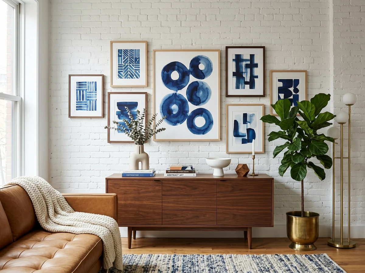
Every good gallery wall is built outward from one anchor — the largest or most visually heavy piece. Place it slightly off-centre, then arrange the smaller works around it so the composition feels grounded. Without an anchor the eye has nowhere to land and the wall reads as scattered fragments.
2. Lay It Out on the Floor First
Never hang blind. Arrange the whole composition on the floor, shuffle until the balance feels right, then trace each frame onto paper and tape the templates to the wall before a single nail goes in. The floor rehearsal is the difference between a confident wall and a wall full of spare holes.
3. Keep Spacing Tight and Consistent
The single rule that separates designer from amateur: a consistent 5 to 8cm gap between every frame. Tight, even spacing makes a mixed collection read as one intentional composition. Uneven gaps make even beautiful pieces look like they drifted there by accident.
4. Go Salon-Style, Floor to Ceiling
The salon hang fills a whole wall, floor to ceiling, in a dense, layered arrangement — the most dramatic gallery wall there is. It suits a staircase, a dining room, or a tall accent wall, and a collection built up over years. Dense and edge-to-edge, it reads as a lifetime of looking rather than a single shop.
5. Build a Symmetrical Grid
For a calm, modern look, hang identical frames in an even grid — a 2x2, 3x3, or a single row — with the same art style throughout. The strict geometry reads ordered and contemporary, perfect above a sofa or bed where a loose arrangement would feel restless. Precision is the whole charm.
6. Prop a Picture Ledge for Flexibility
A picture ledge lets you lean and layer prints rather than committing to nail holes, so you can swap and rearrange whenever the mood changes. Overlap a few pieces, mix in a small mirror or object. It's the lowest-commitment gallery wall and the easiest to keep fresh through the seasons.
7. Hang a Diptych or Triptych
Two or three matching panels of one image — a diptych or triptych — read as a single calm statement rather than a busy collection. A panoramic landscape split across two frames, or a series of three, tells one story across the wall. It's the gallery wall for people who find a full salon hang too much.
8. Follow the Stairs on the Diagonal
A staircase wall wants a gallery that climbs with it. Arrange frames on the diagonal, keeping a consistent gap measured from the stair line rather than the floor, so the group rises with the steps. It turns the most awkward wall in the house into its most dynamic display.
9. Make One Oversized Piece the Whole Statement
Sometimes one is enough. A single oversized canvas or print — bigger than feels comfortable, two-thirds the width of the furniture below — makes a calmer, more confident statement than a wall of small frames. The empty space around it is part of the composition. Restraint reads as confidence.
10. Mix Frames Within One Colour Family
For collected-not-chaotic, vary the frame widths and styles but keep them all in one colour family — all black, all warm wood, all brass. The single colour thread unifies a mix of art styles and frame shapes into a coherent wall that still feels gathered over time rather than bought as a set.
11. Include Objects, Not Just Frames
A gallery wall reads more personal when it mixes in dimensional things — a small mirror, a woven hat, a plate, a sculptural sconce, a clock. The variation in depth and material stops the wall feeling flat and makes it a record of a life rather than a row of pictures. Keep the colour palette tight to hold it together.
12. Light the Wall to Finish It
A gallery wall reads finished when it's lit. A picture light over the anchor piece, a pair of wall sconces flanking the group, or directional ceiling spots make the art glow in the evening and signal that the wall was designed, not just filled. Light is the step most people skip and the one that elevates the result.
13. Dedicate a Wall to One Theme
A themed gallery — all black-and-white photography, all botanical prints, all family portraits, even a pet portrait wall — reads more deliberate than a mixed bag. The single subject or palette unifies the collection and tells a clear story. It's the easiest way to make a gathered set of pieces feel curated.
14. Anchor a Gallery Above the Sofa or Bed
The classic placement: a gallery wall floating above the sofa or behind the bed. Keep the arrangement within the width of the furniture below, with the bottom row a hand's-width above the sofa back or headboard so the group relates to the furniture rather than drifting toward the ceiling. Related, not marooned.
The Method Behind a Gallery Wall That Works
The layouts above are the menu; the principles below are the rules that make any of them work — the anchor piece, the consistent spacing, the eye-level centre, and the 70/30 ratio that keeps a wall from reading cluttered.
Anchor on the Largest Piece
Every gallery wall has a single anchor — the largest piece, the most visually dominant work, or the piece with the most personal significance. The arrangement builds outward from this anchor.
The anchor is typically placed slightly off-centre in the overall composition — closer to the lower third than the middle. This is because gallery walls usually sit above furniture (a sofa, a console, a dining table), and the eye reads the anchor in relation to the furniture below rather than in isolation.
Other pieces orbit the anchor in clusters. Two or three smaller pieces close to the anchor (within 3-5 inches), with progressively wider spacing toward the edges of the arrangement.
The Frame Palette
Mixed frames almost always read more collected than matched frames. The trick is mixing within a constrained palette.
Three frame finishes work in most rooms:
- Black wood (matte or stained, never glossy)
- Brass (raw or aged, never polished)
- Natural wood (oak, walnut, or limed)
A gallery wall using these three finishes across all eleven or fifteen frames reads cohesive without reading matched. Adding a fourth finish (white frames, silver, painted colours) tends to introduce visual chaos.
Within each finish, the frame widths can vary — from narrow gallery profiles to wider ornate antique frames. The consistency comes from the colour palette, not from the profile.
The Matting Question
Matting (the white or cream border between the artwork and the frame) is the most underrated unifier of gallery walls. Pieces that wouldn't otherwise relate to each other read coherent when they share consistent matting.
The standard cosy matting: a 5-8cm cream or off-white mat board around the artwork, regardless of the artwork's size. Smaller works can have wider proportional mats; larger works can have narrower ones. Consistent matting allows wildly different artwork — a Renaissance print, a child's drawing, a botanical sketch — to live on the same wall.
For artwork that doesn't lend itself to matting (canvases, three-dimensional objects, vintage maps), the alternative is consistent frame style across these unmatted pieces.
Spacing: The Most Common Mistake
Spacing between frames in a gallery wall is the easiest thing to get wrong and the easiest thing to fix.
The working range is 2-4 inches (5-10cm) between frames. Closer than 2 inches and the works read as crowded; further than 4 inches and the cohesion breaks down.
Consistency matters more than the exact number. A gallery wall with all 3-inch spacing reads composed. A gallery wall with random spacing reads chaotic. If varying the spacing is intentional, vary it on a system — wider spacing toward the edges of the arrangement, tighter spacing in the centre clusters.
Plan on the Floor First
Lay every piece face-up on the floor in front of the wall where it will hang. Move pieces around for fifteen to thirty minutes until the arrangement settles. Photograph the final layout from directly above.
Cut paper templates the size of each frame and tape them to the wall in the planned arrangement. Live with the paper templates for at least 24 hours before nailing. The arrangement that looked correct in photographs at 6pm often needs adjusting in morning light.
When ready to hang, nail through the paper templates — the nails end up exactly where they need to be, and you remove the paper afterward.
Salon Hang Versus Grid
Two distinct gallery wall styles work in different contexts.
The salon hang — dense, asymmetric, varied in frame size and shape, spacing tighter than 3 inches in places, looser elsewhere. Reads traditional. Best in dining rooms, libraries, hallways, and stairwells. The reference is 19th-century European salon walls.
The grid hang — evenly spaced, often identical frames, structured arrangement. Reads modern and editorial. Best in offices, behind sofas, and as a single feature in an otherwise plain room. The reference is contemporary gallery hanging.
Mixing the two in the same room generally fails. Pick one approach per wall.
For salon hangs, expect the arrangement to evolve over years as new pieces get added. The composition stays dynamic. For grid hangs, the arrangement is fixed once installed — adding a sixteenth piece to a 5x3 grid means rebuilding the whole grid.
What to Hang in a Gallery Wall
The most successful gallery walls mix sources rather than working from a single artist or style. The mixed sources is what makes the wall read as collected.
Working categories:
- One or two pieces of "real art" — original paintings, prints, photographs from a real artist
- Found objects in frames — vintage maps, antique book pages, pressed botanicals
- Personal items — children's drawings, family photographs, postcards
- Decorative objects — small ceramics on shadow-box mounts, small mirrors, small textiles
- Bought prints — limited editions or open editions from print sellers
Mixing all five categories produces a wall that reads as personal rather than purchased. A wall from a single category — even good single category, like all original paintings — tends to read as a curated collection rather than as a home.
A gallery wall built from five sources reads as personal. A gallery wall built from one source reads as a curated collection, no matter how good the source is.
Heights and Eye Level
The standard rule for hanging single pieces — centre at 57 inches (about 145cm) from the floor — does not apply directly to gallery walls. Gallery walls have a centre of gravity rather than a single centre.
For gallery walls above furniture (most common), the bottom of the lowest frame should sit 6-10 inches (15-25cm) above the top of the furniture. Lower and the wall reads disconnected from the furniture; higher and it floats.
For freestanding gallery walls (in a hallway, on a staircase, on a plain wall), the centre of gravity sits around 145-155cm from the floor — eye level for an average standing adult. The arrangement can extend upward toward the ceiling, but the visual weight should concentrate at eye level.
Common Mistakes Worth Avoiding
Hanging too high. The default gallery wall mistake is hanging the whole arrangement too high above the furniture. 6-10 inches above the furniture is correct.
Identical frames in different finishes. A 30cm black frame next to an identical 30cm white frame next to an identical 30cm brass frame reads as "decorating," not as collecting. Vary frame styles, not just colours.
Photo prints in cheap clip frames. Almost always uncosy. If a piece is worth hanging, it's worth a proper frame.
Word art and signage. "Live, Laugh, Love" and equivalents in any form drag down everything else on the wall.
Sets of three or six. A "trio" of identical prints in identical frames spaced evenly reads as set decoration. Single pieces or full gallery walls of varied work — not matched trios.
A gallery wall takes longer to plan than to hang and looks better when it has been allowed to evolve over years rather than installed in a weekend.