The wall behind my bed is limewashed in Bauwerk Colour's "Tobacco" — a soft warm brown that shifts across the day from clay to cocoa to dusk-amber. The other three walls are the same colour. There is no contrast, no accent, no single feature. The whole room is the accent, against the white-ceilinged hallway outside. This is what accent walls have become.
The 2010s accent wall was usually one dark grey or teal wall in a room of light grey walls, behind the sofa or the bed. It worked briefly because the contrast looked decisive in photographs. It stopped working because the rooms aged into looking like real-estate listings rather than homes.
The current generation of accent walls is more sophisticated, more tonal, and harder to get wrong.
Keep reading from here: Textile Layering Guide and Warm Paint Colour Master Guide.
The accent wall has grown up since the single dark wall in a beige room. These thirteen ideas cover the modern versions — tonal, textured, panelled, drenched — that add depth and warmth without dating the room. Pick the one that suits your wall and how much commitment you're ready for.
1. Go Tonal, Not High-Contrast
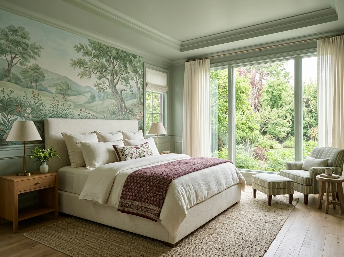
The modern accent wall is tonal — a shade or two deeper than the other walls, in the same colour family — rather than a jarring contrast. A warm room with three walls in a soft clay and one in a deeper version reads layered and intentional. The high-contrast single dark wall is what dates; tonal is what lasts.

2. Colour-Drench the Whole Wall and Beyond
Take the accent colour past the wall onto the ceiling, the trim, even the inside of an alcove, and the room reads enveloping rather than divided. Drenching one end of a room — wall, ceiling, woodwork — makes a deliberate pocket of colour that's far more sophisticated than a single flat accent wall.

3. Panel the Wall for Texture
Tongue-and-groove, vertical batten, or a panelled wall adds architectural texture that flat paint can't. Painted out in the wall colour it reads quiet and built-in; in a contrast it becomes the feature. Either way the relief catches light and shadow through the day, giving the wall depth a flat surface lacks.

4. Limewash for Movement and Depth
Limewash paint gives a wall soft, cloudy tonal movement that flat paint can't match — the colour shifts subtly across the surface and changes with the light. A limewashed accent wall in a warm earth tone reads organic and timeworn, like a wall that's always been there. Texture and colour in one finish.

5. Use a Warm Wood-Clad Wall
Cladding a wall in timber — reclaimed boards, slatted oak, or a warm veneer — brings the warmth of natural wood and a strong directional texture. A wood accent wall behind a bed or sofa reads cabin-warm and adds the one material that makes almost any room cosier. The grain is the pattern.

6. Make the Chimney Breast the Accent
The chimney breast is the natural accent wall — it already protrudes and draws the eye. Paint it a deeper tone, panel it, or clad it in stone or tile so the architecture becomes a deliberate feature. Owning the chimney breast reads more confident than trying to blend it into the surrounding wall.

7. Try a Warm Wallpaper or Mural
A single wall of warm-toned wallpaper — a textured grasscloth, a soft botanical, a tonal pattern — adds depth and personality without committing the whole room. Grasscloth in particular brings tactile warmth and reads sophisticated. Keep the rest of the room quiet so the papered wall carries the interest alone.

8. Frame an Alcove in a Deeper Tone
Painting the inside of an alcove or recess a deeper tone than the surrounding wall turns built-in shelving into a feature and gives a room subtle depth. The darker recess makes objects and books on the shelves pop forward. It's a small, low-commitment accent that reads considered and architectural.

9. Stone or Tile a Feature Wall
A stone, brick, or zellige-tiled wall — behind a wood-burner, a bed, or a bath — brings hard natural texture that contrasts beautifully with soft furnishings. The irregular surface catches light and reads grounded and permanent. It's the accent wall that adds the most tactile material weight to a room.

10. Paint Behind Open Shelving
An accent colour behind a run of open shelves makes the shelves and their contents read as a deliberate composition. The colour frames the books and objects and ties the display to the wall. It's a way to get an accent wall and styled shelving working together as one considered feature.

11. Keep the Accent in the Same Warm Family
Whatever the accent, keep it in the warm family of the room — a deeper terracotta against clay walls, a moss against sage, an ochre against cream. An accent that jumps to a cool or clashing colour fights the room; one that deepens the existing warmth reinforces it. Harmony reads more expensive than contrast.

12. Let Art or a Headboard Be the Accent
Sometimes the accent isn't paint at all — an oversized artwork, a wall-to-wall upholstered headboard, or a large textile hung flat creates a focal wall with colour and texture and no commitment to a finish. It's the renter-friendly accent wall, and it's easily changed when the mood shifts.

The Method Behind an Accent Wall That Lasts
The ideas above are the menu; the principles below cover which wall to choose, how tonal beats high-contrast, and the difference between an accent wall that dates and one that reads timeless.
Tonal Accent Walls
The strongest single accent move in a warm-neutral room is a tonal accent wall — the same colour family as the other walls, painted one or two shades deeper, on one specific wall.
In a Setting Plaster bedroom (Farrow & Ball's warm dusty pink), the wall behind the bed becomes Sulking Room Pink (the same family, one step deeper). In a Skimming Stone bedroom, the accent is Strong White or School House White. In a Slipper Satin bedroom, the accent is Joa's White or Wevet, depending on the warmth of the existing wall.
The contrast is subtle — visible from across the room, but not jarring. The room reads as having depth rather than as having a "feature wall." Studio McGee, Beata Heuman, and Rita Konig have all worked this approach across multiple projects in the last three years.
Colour Drenching
Colour drenching — painting all four walls, the ceiling, the trim, and sometimes the doors and built-ins in the same colour — is the strongest current accent move. The "accent" becomes the entire room rather than one wall.
The technique works best in rooms with limited natural light (the colour adds depth rather than fighting daylight), in small rooms (the lack of contrast makes the room feel larger), and in rooms where the architecture is plain (the colour does what trim and detail cannot).
Colours that drench particularly well: deep moss greens (Farrow & Ball Green Smoke, Studio Green; Benjamin Moore Sherwood Green), warm browns (Bauwerk Colour Tobacco, Farrow & Ball London Clay), soft warm pinks (Setting Plaster, Sulking Room Pink, Pink Ground), and deep ochres or burnt earth tones (Little Greene Light Bronze Green, Farrow & Ball Brinjal).
Skip cool greys, true blues, and saturated jewel tones for colour drenching — they tend to feel oppressive across an entire room. Warm earth tones work because they read as enveloping rather than dark.

Panelling as an Accent
Panelling adds texture without committing fully to colour. Three panelling approaches work well in cosy rooms:
Tongue-and-groove (T&G). Vertical or horizontal boards, usually painted in a warm white or the same colour as the walls. Half-height (around 1.2m up the wall) is the classic placement. Reads as cottage-style and works in any room, but particularly behind beds, in dining rooms, and in entryways.
Board-and-batten. Wider boards with thin battens running vertically over them. More structured than T&G, reads as grown-up. Best as a full accent wall or as half-height panelling in a dining room or bathroom.
Beadboard. Narrower vertical boards with a beaded edge between each. More traditional than T&G, suits older houses and country interiors. Best in kitchens and bathrooms.
Paint the panelling in the same colour as the rest of the room for a subtle textured accent, or in a slightly deeper colour for a more pronounced one. Panelling in white in a warm-coloured room reads as too contrasty; panelling tonal with the walls reads as architectural.
DIY panelling using primed MDF strips, glue, and finish nails costs around £80-200 per accent wall in materials. Pre-made panelling kits from suppliers like Wall Panelling Experts or Cotswold Beadboard run £200-500 for a typical bedroom wall.
Limewash and Plaster Finishes
Limewash and clay plaster create walls with visible variation in tone and texture across the surface. Light moves across them during the day in a way flat paint cannot replicate.
Limewash paint specifically — Bauwerk Colour, Pure & Original, or Marston & Langinger — applies in two coats and produces a soft, cloudy, slightly mottled finish. The colour is part of the texture; thinned applications show more variation, thicker applications less.
Limewash works particularly well on:
- Bedroom walls behind beds (the morning light reveals the variation)
- Single accent walls in larger rooms
- Whole-room drenched applications where the texture compounds across surfaces
Microcement and Venetian plaster finishes work similarly but cost more (£40-80 per square metre installed by a specialist). Limewash DIY application is achievable with two coats and a wide flat brush, total cost around £80-150 per wall in paint plus a one-time investment in the proper brush.
The Headboard-Wall Accent
The wall behind a bed is the most common accent wall in modern homes, and the easiest to get right. The standard moves:
- Half-height panelling rising to about 1.2m, painted in the wall colour
- A tonal accent — one shade deeper across the entire wall
- Limewash in the same family as the other walls
- A large unframed canvas or tapestry covering most of the wall, treated as the accent
- A custom headboard upholstered in linen or wool that rises to mid-height of the wall, acting as a textile accent without paint
The full-wall mural or wallpapered headboard wall is the version most likely to date. Skip botanical murals, geometric wallpaper, and any pattern that demands a strong visual register.
"The accent wall is no longer one strident wall. It is the depth that the whole room takes when colour is applied with conviction."
The Accent Wall Mistakes Worth Avoiding
One dark wall in a light-grey room. This is the 2010s mistake. Skip entirely.
Geometric or patterned wallpaper as an accent. Dates quickly. The pattern that looks bold this year reads tired in three.
An accent wall painted in a colour that doesn't appear elsewhere in the room. The wall reads as orphaned. Whatever colour goes on the accent wall should also appear in a cushion, a throw, an artwork, or the rug.
Brick or stone veneer accent walls. They almost always read as fake regardless of how good the product is. Real exposed brick or stone is wonderful; veneer is not.
Wood "shiplap" in white plastic. Real wood shiplap is fine; the plastic versions sold as DIY kits are not.
When to Skip the Accent Wall Entirely
In a room with great natural light, beautiful proportions, or strong architectural detail (high ceilings, original fireplaces, crown moulding), an accent wall fights what the room already does well. Paint everything the same warm neutral and let the architecture be the accent.
Similarly, in a room dominated by a strong piece of art, a textured rug, or a generous wall of bookshelves, the wall colour should recede rather than compete. The accent has already been made by something else; the walls support it.
The accent wall is no longer about one wall standing out. It's about the room taking depth — through tone, through texture, through colour applied across the whole room or through a single subtle shift. The decisive contrast is over.