The living room here is painted Farrow & Ball Setting Plaster on all four walls, with the trim in the same colour (drenched). I chose it after testing six other warm neutrals in two-foot boards moved around the room across five days. At 11am the colour reads as pale clay; at 4pm in November, it shifts to a deeper pink-amber; under the lamps at 9pm, it glows almost terracotta. The same paint, three different rooms across one day. That is what a warm paint colour does.
Paint colour is the single most consequential decoration decision in any room. Get it right and the warmth persists across the seasons and the years. Get it wrong and no amount of textile layering, lamp swapping, or art hanging fully compensates. It's why the warm paint colors for your living room deserve more deliberation than almost any other purchase in the house — they're the backdrop everything else is read against.
The mistake most people make is choosing paint based on what it looks like in a paint shop's spotlight, or on a digital colour chip on a phone screen. The colour you commit to has to perform in your specific light at multiple times of day. This guide walks the colours that consistently hold their warmth, the testing process, and the room-by-room logic of choosing for orientation and use.
What Makes a Colour Read as Warm
Warmth in paint is not the same as intensity. A pale cream can read warmer than a deep teal because the undertone is what matters, not the saturation.
The undertones that read warm:
- Pink — soft pinks, dusty pinks, terracotta-pinks, salmon
- Yellow — buttery yellows, ochre, honey, mustard
- Amber and orange — rust, burnt orange, deeper terracottas
- Warm brown — cocoa, taupe, soft umber
- Warm green — sage, olive, moss, mushroom-green
- Warm grey — greys with a pink or yellow undertone (called "greige" sometimes)
The undertones that read cool:
- Blue — every saturation
- Cool grey — greys with a blue undertone
- Cool green — emerald, jewel-tone green, mint
- Cool white — whites with blue undertone
A pale Farrow & Ball Skimming Stone (which appears almost identical to many "white" paints) reads warm because of its slight pink-warm undertone. The equivalent-saturation Benjamin Moore Decorator's White reads cool because its undertone shifts blue. Same lightness; different warmth.
The lists above are organised by undertone. This gallery is organised by what the colour actually does in a room — pale and airy, pink and enveloping, green and grounding, or deep and drenched. Each one is a real, buyable shade with a note on where it works. Sample before you commit; a swatch on a screen is not a colour on your wall.
1. Farrow & Ball Slipper Satin — the warm white that isn't cold
The reliable warm white. A faint pink undertone keeps it from going clinical in north-facing rooms, where most whites turn grey. Pair it with oak floors, linen upholstery, and aged brass. Eggshell on walls, satin on trim.
2. Benjamin Moore White Dove — the warm-white standard
The off-white designers reach for when they want clean without cold. A soft cream undertone reads fresh in bright rooms and gentle in dim ones. It's the safe, never-wrong choice for trim, ceilings, and whole-room schemes alike.
3. Sherwin-Williams Accessible Beige — the modern greige
A balanced gray-beige that never tips yellow or purple, which is why it's been a top seller for years. It reads warm and grounded with light oak floors and black metal accents. The greige to choose when flat beige feels dated but you're not ready for colour.
4. Backdrop Moonlight — the white with a built-in hug
A creamy wash that embraces a room in warmth where ordinary whites read cold. In strong daylight it looks white; in low light it warms. The swatch difference next to a cool white looks tiny — the room difference does not.
5. Little Greene Slaked Lime — the soft off-white for old houses
A gentle warm off-white that suits older homes and period detail without looking stark against original timber. It holds warmth at small scale, which makes it a quiet, forgiving choice for hallways and box rooms.
6. Farrow & Ball Setting Plaster — the dusty pink everyone copies
The pink-cream behind countless editorial interiors, and for good reason: it reads warm in almost any light and especially redeems north-facing rooms. Drench it across walls, ceiling, and trim for the full effect. Pair with cream, oak, and a touch of oxblood.
7. Sherwin-Williams Romance — the pink-tinted neutral
A pale pink-tinted neutral that does the warming work of Setting Plaster for those on the other side of the Atlantic. Soft enough to read as a warm white at a glance, pink enough to glow under lamplight. Ideal for north- and east-facing bedrooms.
8. Farrow & Ball Sulking Room Pink — the deeper, dustier pink
A more saturated, muted pink for rooms that want noticeable colour without going bold. It suits a snug, a dressing room, or an accent wall behind a bed. Reads sophisticated rather than sweet because the grey in it tempers the pink.
9. Chalky Rose — the timeworn dusty rose
A chalky, dusty rose that designers describe as already belonging to the house — warm, grounded, and free of any candy brightness. It saturates a living room without dominating it, letting furniture and art carry the room while the walls glow quietly.
10. Farrow & Ball Bancha — the warm sage with a yellow undertone
A sage green warmed by a yellow undertone, which keeps it from the grey-green coolness that dates quickly. It grounds a south-facing room beautifully and pairs with cream, rattan, and unlacquered brass. Works as a whole-room colour or a single panelled wall.
11. Olive and Eucalyptus — the uplifting earthy greens
The earthy greens designers now favour over desaturated sage: olive, eucalyptus, and moss read more uplifting and alive. They bring grounding and a connection to nature into a living space, and they hold up against warm wood and leather without going murky.
12. Farrow & Ball Green Smoke — the deep sage for drenching
A deeper, smoky sage that comes alive when drenched across a whole room for evening drama. It suits a dining room or a study that's used mostly after dark, where lamplight and candlelight bring out its depth. Brass and warm wood keep it from feeling heavy.
13. Mushroom Taupe — the quiet-luxury neutral
The taupe that makes a room feel expensive without asking for attention — a soft gray-beige balance that designers call quiet luxury. Match its undertone to your floors: warm taupe with warm wood, neutral taupe with cooler floors. It reads custom and intentional in any light.
14. Sherwin-Williams Cavern Clay — the sunbaked terracotta
A warm terracotta with a sunbaked, grounded quality that pairs beautifully with greenery, leather, and warm metals. It glows in rooms with plenty of natural light. Use it where you want energy and warmth rather than calm — an entry, a studio, a sociable kitchen.
15. Tobacco Brown — the warm, timeworn mid-tone
A chalky tobacco brown that feels like it already belongs to the house — warm, organic, and grounding. It's part of the earthy mid-tone palette designers are reaching for in 2026: rooms that feel timeworn rather than freshly decorated. Limewash it for texture as well as colour.
16. Farrow & Ball London Clay — the deep warm brown
A deep, terracotta-tinged brown for the most enveloping drenched rooms. In a west-facing room, the warm evening light reveals its depth; by day it's a quiet, grounding backdrop. Pair with cream upholstery and warm metals so it wraps the room rather than darkening it.
17. Farrow & Ball Studio Green — the near-black moss
Read as near-black in low light and deep moss in daylight, this is the colour for a room that wants drama: a study, a snug, a dining room for evenings. Drench it completely — walls, ceiling, trim — and let warm lamplight and brass do the rest. Not for rooms you sit in at midday wanting brightness.
18. Soft Charcoal — the warm dark neutral
A warm-leaning charcoal — not a cool battleship grey — gives the depth of a dark room without committing to colour. It flatters art, makes a media room or evening lounge intimate, and reads modern with pale furniture and a light rug to balance the weight.
The Best Warm Paint Colours for a Living Room (and Every Other Room)
Across hundreds of rooms in different lights and orientations, these colours hold their warmth reliably. Listed by manufacturer and approximate match where possible.
Pale warm whites and creams
- Farrow & Ball Slipper Satin — soft warm white with a slight pink undertone. Performs well in north-facing rooms.
- Farrow & Ball School House White — slightly warmer than Slipper Satin, with more ochre.
- Farrow & Ball Wevet — very pale, very warm. Suits south-facing rooms that can hold less colour.
- Farrow & Ball Strong White — warm grey-white that reads almost like pale linen.
- Benjamin Moore White Dove — the warm-white standard. Slight cream undertone.
- Benjamin Moore Simply White — warmer than its name suggests. Works in many rooms.
- Sherwin-Williams Alabaster — warm white with subtle yellow undertone.
- Sherwin-Williams Natural Linen — slightly more saturated cream/oat undertone.
- Little Greene Slaked Lime — soft warm off-white. Excellent in older houses.
Warm pinks (for rooms wanting more colour)
- Farrow & Ball Setting Plaster — dusty pink-cream. Used in countless editorial interiors for good reason.
- Farrow & Ball Sulking Room Pink — deeper version of Setting Plaster. Works for accent walls.
- Farrow & Ball Pink Ground — slightly more peach than Setting Plaster.
- Benjamin Moore First Light — pale pink-cream similar to Setting Plaster.
- Benjamin Moore Pleasant Pink — slightly more saturated pink.
- Sherwin-Williams Romance — pink-tinted neutral.
- Sherwin-Williams Heart's Delight — pale pink with warm undertone.
Warm greens (for rooms with character)
- Farrow & Ball Bancha — sage green with warm yellow undertone.
- Farrow & Ball Green Smoke — deeper sage, suits drenched rooms.
- Farrow & Ball Studio Green — very deep moss green for drenching.
- Benjamin Moore Sherwood Green — deep moss, similar register to Studio Green.
- Little Greene Pleat — warm pale green-grey.
- Little Greene Etruria — deeper pale green.
Deeper warm earth tones
- Farrow & Ball London Clay — deep warm brown with terracotta undertones.
- Farrow & Ball Sulking Room Pink — deeper than Setting Plaster.
- Farrow & Ball Brinjal — deep aubergine with warmth.
- Bauwerk Colour Tobacco — warm brown limewash, gives texture as well as colour.
- Little Greene Light Bronze Green — deeper warm green.
- Sherwin-Williams Cavern Clay — warm terracotta.
This list is starting points. Within each manufacturer's range, dozens more colours work — the test is the undertone and the consistency across light conditions. If you want to see these palettes assembled into whole rooms rather than swatches, the warm-neutral lounge palette guide and the warm Scandinavian palette both build complete schemes around these exact colours.
The Orientation Question
The same paint colour reads differently in rooms with different orientations. The cardinal directions and what they need:
North-facing rooms
North-facing rooms receive cooler blue-shifted light throughout the day. They never get direct sunlight. The light is consistent but cool.
Cool paint colours intensify the chill. Warm paint colours compensate. The reliable warm choices for north-facing:
- Farrow & Ball Setting Plaster (pink undertone counterbalances blue light)
- Benjamin Moore First Light or Heart's Delight (similar logic)
- Sherwin-Williams Romance (pink-tinted)
- Little Greene Slaked Lime (warm off-white)
- Any of the Farrow & Ball pinks (Sulking Room Pink, Pink Ground)
What not to do in a north-facing room: cool greys, true whites, blues. These intensify the existing coolness and produce rooms that feel clinical even when decorated warmly. If your room is north-facing and the cool light is the whole problem, the cool vs warm palette breakdown goes deeper on which orientations can carry cooler colours and which can't.
South-facing rooms
South-facing rooms receive warm direct sunlight throughout the day. They can hold cooler colours without going cold because the natural light compensates.
The colours that work in south-facing:
- Almost any from the warm-paint list, because the warm light doesn't fight them
- Cooler greens (Farrow & Ball Bancha, Green Smoke) that wouldn't work in north-facing
- Deep moss greens for drenching (Studio Green, Sherwood Green)
- Warmer whites that don't need to fight cool light
South-facing rooms are forgiving. The light does much of the warmth work, so the paint can lean cooler.
East-facing rooms
East-facing rooms receive warm morning light and shift to cool afternoon shadow. The paint needs to work in both.
The reliable choices: warm whites with subtle undertones that read warm in either light. Farrow & Ball Slipper Satin, School House White, or Joa's White. Benjamin Moore White Dove. Sherwin-Williams Alabaster.
East-facing bedrooms are particularly suited to warm whites that pick up the morning light without amplifying it into yellow.
West-facing rooms
West-facing rooms receive warm late-afternoon and evening light. The morning is cooler shadow.
West-facing rooms can hold deeper colours — ochres, terracotta, warm browns, mossy greens — because the warm evening light reveals the warmth. The cooler morning shadow may make the colour appear slightly different, but the daily warm light returns the room to its intended warmth.
A west-facing living room is one of the best candidates for a drenched warm earth tone (Farrow & Ball London Clay, Bauwerk Colour Tobacco, Sherwin-Williams Cavern Clay).
How Bulb Temperature Changes Everything After Dark
You can choose the right warm paint colour and still lose it at 6pm — to the wrong bulb. Colour temperature, measured in kelvin, decides whether your Setting Plaster glows or goes grey once the sun's gone.
Here's the short version. 2700K is warm white, the colour of an old incandescent bulb, and it flatters every warm undertone — pinks deepen, creams turn buttery, ochres come alive. 3000K is still acceptable, a touch crisper. 4000K and above is "cool white" or "daylight," and it's where warm paint goes to die: it pulls the pink out of Setting Plaster and leaves a flat greige, strips the glow from Slipper Satin, and makes a carefully chosen Sherwin-Williams Romance read like builder's magnolia.
The trap is that bulbs rarely announce this on the front of the box. Check the small print for the kelvin number, or look for "warm white" and avoid "cool white" and "daylight." If you've ever repainted a room because it "felt cold at night" — the paint may have been fine, and the bulbs the actual culprit.
This is also why you test samples under your own lamps, not the shop's. A showroom runs bright, neutral track lighting; your living room runs two table lamps at 2700K. Same paint, completely different colour after dark. Swap every bulb in the room to 2700K before you so much as open a sample pot, and half the "this colour went wrong" problems disappear.
One honest caveat: integrated LED fittings and many rental fixtures don't let you change the bulb. If you're stuck with a cool-white fitting you can't swap, choose a paint with a stronger warm undertone to begin with — a true Setting Plaster or Pink Ground rather than a barely-there warm white — so there's enough warmth left to survive the lighting.
The Testing Process
Paint colour decisions cannot be made reliably from chips, online images, or even paint shop tests. The colour has to be observed in the actual room across multiple lighting conditions.
The process:
Step 1: Narrow to 3-4 candidates. From the warm-paint list, choose 3-4 colours that match your room's orientation and the warmth level you want. Don't try more than four — comparison becomes confused beyond that.
Step 2: Buy sample pots. £4-7 per sample pot from any of the manufacturers. Don't substitute with paint store custom samples; the formula is sometimes different from the named product.
Step 3: Paint large samples. Two methods:
-
Direct on the wall: paint 50×50cm patches on multiple walls (north-facing wall, south-facing wall, near light source, in shadow). At least two coats.
-
On boards: paint two-foot square boards (foam-core or canvas board) with two coats. Move the boards around the room to test in different positions and light conditions.
Step 4: Live with the samples. Minimum three days, ideally a week. Look at them at:
- Morning light (7-9am)
- Midday (11am-1pm)
- Late afternoon (3-5pm)
- Evening lamp light (8-10pm)
Take phone photos at each time of day. Compare the photos.
Step 5: Commit. The colour that reads warm across all four observation times is the colour. The colour that "looks great" at one time and "looks meh" at another is the wrong colour — choose differently.
The paint colour you commit to has to perform in your specific light at multiple times of day. The colour that looks great at 11am and goes grey under lamp light is the wrong colour, regardless of how popular it is.
What Goes Wrong Without Testing
The most common paint mistakes:
Choosing from a phone screen. Phone screens shift colour. The image you saved on Pinterest is not the colour in your hand.
Choosing from the paint shop sample chip. Sample chips are too small to read accurately and are lit by paint-shop spotlights designed to flatter colours.
Choosing from one room photograph. The colour in an Instagram post was photographed in specific light at a specific angle. Your room has different light and different angles.
Skipping the late-afternoon test. Many warm-seeming colours go grey or muddy in late afternoon. The 4-5pm light reveals undertones that morning light hides.
Skipping the lamp light test. Paint that reads warm under daylight can go cold under cool-white evening bulbs. If you can't change the bulbs (rental fixtures, integrated LEDs), the paint has to work with what's there.
Painting one coat to "see how it looks." One coat reads differently from two coats. Always sample with the full two-coat finish.
Drenching vs Accent Walls
Two main approaches to applying warm paint in a room:
Drenching. All four walls, the ceiling, the trim, often the doors and built-ins in the same colour. The room reads as enveloped. Best for warm earth tones (browns, deep pinks, mossy greens) and small to medium rooms.
Accent wall. One wall in a tonal accent colour, three walls in the base colour. The current cosy version uses tonal accents (one shade deeper than the rest) rather than contrasting accents. If you're weighing this up, the guide to accent walls in warm rooms covers which walls to choose and when a tonal accent beats a contrasting one.
All four walls, white ceiling, white trim. The standard approach. Works for most rooms with most warm colours.
Limewash for texture. Limewash paint applied across all four walls produces visible texture and tone variation as well as colour. Light moves across the wall during the day in a way flat paint cannot match. Best for warm earth tones.
Specific Room Recommendations
Living room (north-facing): Setting Plaster (drenched) or Slipper Satin all walls with Setting Plaster on one accent wall. For the full scheme around the colour — sofa, rug, lighting — see how to decorate a cosy living room.
Living room (south-facing): Joa's White all walls, possibly with Bancha or Pleat for one accent wall.
Bedroom (north-facing): Setting Plaster (drenched) or Pink Ground.
Bedroom (south-facing): Slipper Satin or White Dove. Bancha or Green Smoke for an accent wall.
Bedroom (east-facing): Slipper Satin, School House White, or Joa's White.
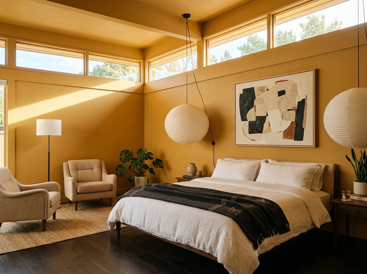
Bedroom (west-facing): Setting Plaster or Sulking Room Pink for drenched. London Clay or Tobacco limewash for deeper drenched.
Kitchen: Slipper Satin or White Dove for clean readability. For cosier kitchens, Setting Plaster or Joa's White. The warm-neutral kitchen palette guide pairs these wall colours with cabinet and worktop choices.
Dining room: Setting Plaster or Bancha for warmth. Studio Green or Sherwood Green for evening dining drama.
Bathroom: Slipper Satin, White Dove, or Setting Plaster. For drenched bathrooms, Setting Plaster, Bancha, or Green Smoke.
Entryway: Setting Plaster, Slipper Satin, or whatever colour matches the adjacent main room. Continuity matters more than statement in transitional spaces.
Paint colour is the foundation of every other cosy choice in a room — which is exactly why it's the natural starting point for the whole room-by-room cosy home guide. Test extensively, commit decisively, and the colour rewards you across years. Skip the testing and the paint reads wrong in ways no decoration recovers.