The lounge here is built on four colours: walls in Farrow & Ball Setting Plaster, the sofa in oatmeal linen, one armchair in deep oxblood velvet, brass accents through the lamps and table. That's the entire palette. The cushions, throws, art, and books exist within those four colours. The room has held this palette for four years. It looks better now than it did when I finished it because the materials have softened into their colour rather than fading from it.
A lounge room is used daily for years. The colour palette decisions need to hold up across that duration — through changing seasons, shifting tastes, the accumulation of objects, and the inevitable wear that daily use brings. Most failed lounge palettes fail because they were chosen for a single photograph or a single style moment rather than for long use.
Keep reading from here: Warm Paint Colour Master Guide, Warm Scandinavian, and Cosy Living Room Decorating Ideas That Actually.
A lounge palette has to live for years and read warm across every light. These thirteen complete schemes — wall, upholstery, wood, and accent — are built to last rather than chase a trend. Each is a starting point you can adjust to your light and your pieces. Find the mood you're after.
1. Warm Greige and Oatmeal
The most forgiving lounge palette: a warm greige on the walls, oatmeal and cream upholstery, pale oak, and a single soft terracotta accent. It reads light and calm, flatters most light, and never dates. The neutral base lets you change the accent with the seasons without repainting.
2. Clay and Cream
A soft clay or plaster-pink on the walls, cream and natural-linen upholstery, warm wood, and oxblood or rust accents. The clay reads warm in every light and especially redeems north-facing lounges. It's enveloping without being dark, the warmth doing the work a deep colour usually would.
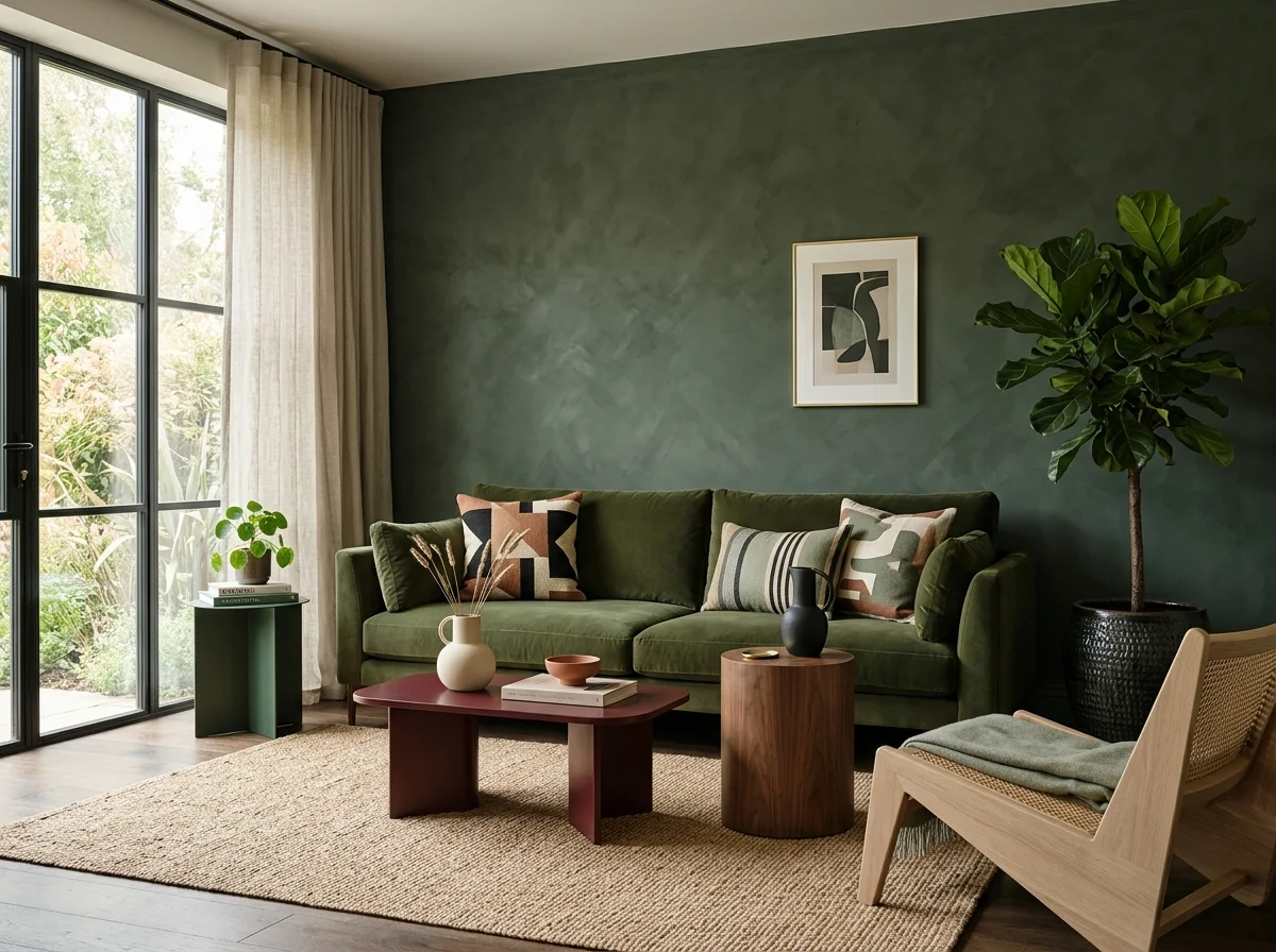
3. Moss Green and Tan
A muted moss or sage on the walls, tan leather and cream upholstery, warm oak, and brass accents. The green grounds the room and reads restful and natural; the tan leather warms it. It's the palette for a lounge that wants character without going dark — nature-led and timeless.
4. Warm White and Wood
The pared-back Scandinavian-leaning scheme: warm white walls, pale wood everywhere, natural-linen and cream upholstery, with texture rather than colour doing the work. One black or charcoal accent for definition. It's the lightest, airiest lounge palette and relies on layered texture to stay warm.
5. Deep Green Drench
For an evening lounge, drench the walls in a deep forest or olive green — walls, ceiling, trim — with cream and tan upholstery and brass lighting. By lamplight the dark green glows and encloses the room in exactly the cocoon a lounge wants after dark. Bold, enveloping, and surprisingly timeless.
6. Terracotta and Charcoal
A warm terracotta or burnt-sienna accent against soft charcoal and cream — earthy and grounded with a touch of drama. The terracotta brings energy, the charcoal anchors it, and natural wood ties them together. It's a confident palette for a lounge with personality, warm without being soft.
7. Honey and Cream
Pale honey or buttery walls, cream upholstery, golden oak, and soft brown accents — a sunny, gentle palette that brings warmth to a room short on natural light. It reads like afternoon sun on a wall even on a grey day. The warmest of the light palettes, ideal for a north- or east-facing lounge.
8. Mushroom and Blush
A sophisticated quiet-luxury scheme: mushroom-taupe walls, blush and cream upholstery, pale wood, and bronze accents. The taupe reads expensive and calm, the blush warms it without going sweet. It's a restrained, grown-up palette that photographs beautifully and lives even better.
9. Navy and Warm Neutral
A deep warm navy as an anchor — on a wall, joinery, or upholstery — against cream, oatmeal, and warm wood, with brass accents. The navy reads as a warm dark rather than a cool one when balanced with enough warm neutral. Classic, grounding, and a good way to use a dark colour without committing the whole room.
10. Tonal Brown and Caramel
A fully tonal brown scheme — cocoa walls, caramel and tan upholstery, walnut wood, cream to lift it — is one of the warmest, most enveloping palettes there is, and very current. The layered browns read rich and timeworn. Keep the textures varied so the tonal scheme has depth rather than reading flat.
11. Sage and Soft White
A pale sage or eucalyptus on the walls, soft white and natural-linen upholstery, light wood, and a muted ochre accent. Fresh, calm, and nature-led, it brings the outside in without going cold. The warm-undertoned green is the key — a grey-green would read chilly where this reads restful.
12. Plaster Pink and Burgundy
Soft plaster-pink walls with deeper burgundy and oxblood accents, cream upholstery, and warm wood — a romantic, enveloping palette that reads grown-up rather than sweet thanks to the depth of the burgundy. It glows under lamplight and suits a lounge meant for evenings and conversation.
13. Test the Palette in Your Own Light
Whatever the scheme, the final step is the same: sample the wall colour on boards and live with your chosen accents in the actual room across a full day. A palette that reads warm at 11am can go cold under lamplight. The scheme that holds its warmth from morning to evening lamp-glow is the one to commit to.
The Method Behind a Lounge Palette
The schemes above are the menu; the principles below are the structure — the three-layer approach, the warm-undertone rule, and how to test a palette in your own light before committing.
The Three-Layer Palette
A working lounge room palette breaks into three layers:
Layer 1: The dominant wall colour. What you see most — walls and ceiling. This colour bears the weight of the room. Warm undertones essential; intensity flexible (pale warm white, mid-tone warm neutral, deeper drenched warm tone all work).
Layer 2: The accent colours. One or two colours that appear in major furniture pieces and large textiles. Examples: an oxblood velvet armchair, a deep moss sofa, a warm tan leather chair. These colours hold the visual interest that the walls don't generate.
Layer 3: The material tones. Wood (oak, walnut), brass (lamps, candlesticks), stone (marble, soapstone), and small ceramics in muted earth tones. These don't read as separate colours but contribute warmth and depth.
Three layers, three to four colours total. Beyond four, the palette starts to confuse.
Six Working Lounge Palettes
Below are six palettes that have aged well in real lounges over multiple years. Each is starting point — adjust based on your existing furniture and orientation.
Palette 1: Warm white minimal
- Walls: Farrow & Ball Slipper Satin or School House White
- Sofa: oatmeal linen
- Accent piece: vintage leather wing chair in cognac
- Materials: oak coffee table, brass lamps, ceramic in unglazed terracotta
- Cushion palette: linen in cream, oatmeal, and one deeper warm (oxblood or moss)
Calm and timeless. Works in north-facing rooms because the warm white compensates for cool light.
Palette 2: Setting plaster pink and oxblood
- Walls: Farrow & Ball Setting Plaster (drenched or accent on one wall)
- Sofa: oatmeal or cream linen
- Accent piece: oxblood velvet armchair or deep burgundy upholstery
- Materials: dark walnut coffee table, brass lamps
- Cushion palette: linen in cream and pink, plus one velvet in deep oxblood
Warm without being saturated. Reads as modern English country.
Palette 3: Moss green drenched
- Walls: Farrow & Ball Studio Green or Sherwood Green (full drench including ceiling and trim)
- Sofa: oatmeal or warm cream linen
- Accent piece: vintage leather armchair in cognac
- Materials: oak coffee table, brass lamps, vintage rug in warm earth tones
- Cushion palette: linen and wool in warm cream, oatmeal, and one deeper green
Atmospheric and editorial. Best in larger rooms with good natural light.
Palette 4: Warm earth tones
- Walls: Bauwerk Colour Tobacco (limewash) or Farrow & Ball London Clay
- Sofa: cream or oatmeal linen
- Accent piece: caned wood chair or rattan
- Materials: oak or walnut, brass, terracotta ceramics
- Cushion palette: warm cream, oatmeal, terracotta, deep brown
The most enveloping warm palette. Suits west-facing rooms particularly.
Palette 5: Mushroom and cream
- Walls: Farrow & Ball Skimming Stone or Stony Ground
- Sofa: cream linen
- Accent piece: mid-century chair in muted brown leather
- Materials: oak, brass, vintage rug in warm neutrals
- Cushion palette: all warm neutrals (cream, oat, putty, mushroom)
Very subtle palette. Reads sophisticated and quiet.
Palette 6: Pale blue and warm
- Walls: Farrow & Ball Borrowed Light or Pale Powder (warm-undertone blue)
- Sofa: oatmeal linen
- Accent piece: terracotta or oxblood velvet armchair
- Materials: oak, brass, ceramic in warm earth tones
- Cushion palette: warm cream, terracotta, soft blue
Cooler base than the others but the warm accents and undertones keep the room from going cold. Suits south-facing rooms.
The Discipline of Restraint
The most common lounge palette failure is adding too many colours. The cushion bought because it was on sale. The artwork in a bright accent colour. The throw in a contrasting pattern. The vase in a colour that doesn't appear elsewhere.
The discipline: every new object brought into the lounge has to live within the existing palette. If it doesn't, it gets placed elsewhere (or not bought).
For an object that doesn't quite fit, ask: which existing colour does this echo? If the answer is "none," the object lives in a different room or stays in the shop.
This sounds rigid. In practice, it produces lounges that read as collected rather than as accumulated. Every object earns its colour place.
How to Choose Between Palettes
The decision factors:
Orientation. North-facing rooms want warmer bases (Setting Plaster, mushroom). South-facing rooms can hold cooler bases (moss green, pale blue). East-facing rooms want warm whites that pick up morning light. West-facing rooms can hold deeper drenched palettes.
Size of room. Small rooms benefit from drenched palettes (Studio Green, Tobacco, Setting Plaster on all walls). Larger rooms can sustain more contrast (lighter walls with darker accent furniture).
Existing furniture. The palette has to absorb what you already own. If you have a deep brown leather sofa, the palette builds around it. If you have a cream linen sofa, the palette extends from that.
Personal preference for energy. Some people want their lounge to read calm and contemplative (warm white minimal, mushroom palettes). Others want it to read warm and enveloping (moss green drenched, tobacco limewash). Both are correct; choose based on temperament.
What to Skip in Lounge Palettes
Cool-toned grey bases. The 2010s grey lounge ages faster than any other palette. Even warm-toned greys ("greige") read flat. Pinks, mushrooms, and putty colours read more current and last longer.
More than two accent colours. A lounge with an oxblood chair AND a mustard cushion AND a teal throw reads confused. Pick one accent colour and stay with it.
Trend colours as palette base. Millennial pink, sage green saturated, the "Pantone colour of the year" — none of these last. Use them as small accents if at all.
Black as a major colour. Black furniture in a lounge ages and uncosies the room. Dark warm brown, deep oxblood, and deep moss green produce the visual weight of black without the coldness.
Cool blue and stark white. Reads coastal and uncosies most lounges. If you want a coastal palette, warm it with terracotta or wood.
Saturated jewel tones. Emerald, sapphire, ruby — they look striking briefly and tire quickly. Muted versions of the same colours (moss instead of emerald, slate instead of sapphire, oxblood instead of ruby) age better.
The lounge palette that lasts is the one chosen for daily comfort, not for a single photograph. Trends produce striking rooms; comfort produces rooms you live in.
The Cushion and Throw Strategy
Once the major palette is set, cushions and throws stay within it. The rules:
- Cushion covers in the palette's colours, never in colours outside it
- Maximum five cushions per sofa, mixed textures within the colour palette
- Throws in one or two colours from the palette, never as the third or fourth accent
- Textures vary (linen, wool, velvet, leather) within the limited colour range
The cushion-and-throw layer is where the palette's depth comes from. Three colours used across five cushions in four different textures reads as much richer than five colours in matching textures.
Building the Palette Over Years
A lounge palette doesn't have to be set at once. The successful approach is:
Year one: paint the walls and choose the major furniture (sofa, one or two accent chairs).
Year two: add the textiles (rugs, throws, cushions) within the palette.
Year three onward: layer in personal objects, art, vintage finds, all within the palette.
The room reads more interesting at year three than at year one because the slow accumulation produces objects that fit the room rather than items that match a styled photograph. The patience compounds.