The cool-toned grey bedroom I painted in 2015 lasted three years before I admitted it was wrong. The room faced north, the light was always blue-shifted, and the grey amplified the cool until the room felt like a hospital ward at 4pm in November. When I repainted in Setting Plaster, the same room with the same furniture and the same north-facing light suddenly worked. The paint was the entire difference.
The cool versus warm palette question is sometimes treated as a matter of personal taste — some people like cool tones, some like warm. In practice, the choice has clearer rules than that. Most rooms work better warm. Cool palettes have a narrower range of conditions in which they succeed.
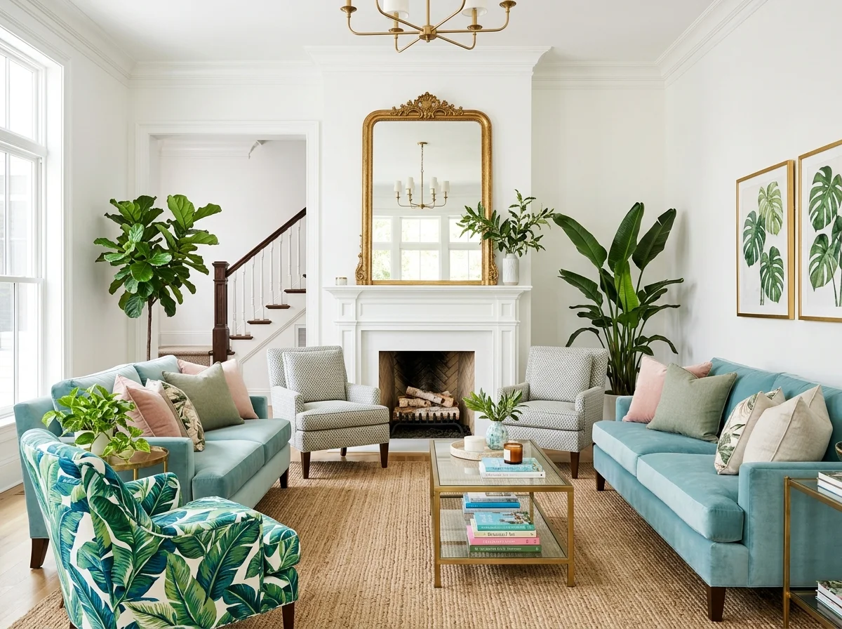
Pairs well with Warm Paint Colour Master Guide, Lounge Room Colour Palette, and Cosy Bedroom Design.
Warm or cool isn't a matter of taste alone — it depends on the room's light, orientation, and purpose. These twelve comparisons and rules help you decide which way a given room should lean, and how to make either work. Find the situation that matches the room you're deciding on.
1. Default to Warm in Living Spaces
Living rooms, bedrooms, dining rooms — the spaces where people gather and relax — almost always read better warm. Warm tones flatter skin, glow under lamplight, and feel inviting. Unless there's a specific reason to go cool, a living space should lean warm. It's the forgiving default for any room meant for comfort.
2. Warm Up Every North-Facing Room
North-facing rooms receive cool, blue-shifted light all day, which makes cool colours read cold and clinical. Compensate with warm tones — pinks, creams, ochres, warm whites — that counterbalance the blue light. A north room painted cool grey feels chilly however well you furnish it; warm it and it comes alive.
3. Let South-Facing Rooms Take Cooler Tones
South-facing rooms flood with warm light all day, which means they can hold cooler colours — sage, soft blue, grey-green — without going cold, because the natural light does the warming. It's the one orientation where a cool palette reliably works. The abundant warm light balances the cool paint.
4. Choose by Undertone, Not Just Colour
Warm versus cool is decided by undertone, not the colour name. A grey can be warm (with a pink or yellow base) or cool (with a blue base); a white, a green, a beige all come in both. Learn to read the undertone — hold a sample against a true white — because the undertone, not the colour family, decides how a room feels.
5. Go Cool in Bathrooms and Utility Spaces
Cool tones suit the rooms where crisp and clean is the goal — a bathroom, a utility, a pantry. A cool white or pale blue-grey reads fresh and hygienic where it would read cold in a living room. Match the temperature to the room's job: cool for clean and functional, warm for cosy and relaxed.
6. Use Warm Light to Rescue a Cool Room
If a room leans cool and reads cold, the fastest fix isn't repainting — it's the bulbs. Warm 2700K light makes even a cool-toned room read warmer, and cool 4000K light makes even a warm room read cold. Before changing the paint, change the light; the bulb temperature shifts a room's warmth as much as the colour.
7. Balance a Cool Palette With Warm Materials
A cool colour scheme needn't read cold if you balance it with warm materials — wood, leather, brass, natural textiles. A cool grey-blue room with warm oak floors, tan leather, and brass reads balanced and sophisticated. The warm materials counterweight the cool paint. Pure cool-on-cool is what reads chilly.
8. Let West-Facing Rooms Go Deep and Warm
West-facing rooms get warm, golden light in the afternoon and evening, which makes them ideal for deeper, warmer colours — ochres, terracottas, warm browns, moss greens. The evening sun brings these rich tones alive. A west room is the best candidate for a bold, warm, drenched colour.
9. Match Temperature to the Room's Mood
Decide what the room is for, then match the temperature. A calm, restful bedroom or a sociable lounge wants warm; a focused study or a fresh, energising kitchen might take cooler. The colour temperature sets the mood as much as the colour itself — warm to relax, cool to sharpen.
10. Test the Decision Across a Full Day
Whichever way you lean, test it in the actual room across the day before committing. A colour that reads pleasantly cool at noon can read cold and grey by evening; a warm tone can read muddy in strong midday sun. Sample boards observed morning, afternoon, and under lamplight settle the warm-versus-cool question for your specific room.
11. Mix Warm and Cool Deliberately
The most sophisticated rooms aren't purely one or the other — they're warm-dominant with a cool accent, or cool-dominant with warm materials. A warm room with one cool-toned artwork or a slate hearth; a cool room with warm wood and brass. The deliberate mix adds depth; the accidental mix reads off. Choose a dominant temperature, then accent with its opposite.
12. When in Doubt, Choose Warm
The safest default for a home is warm. Warm tones forgive more, flatter more, and read cosier across more conditions than cool ones. Cool palettes can be beautiful but they're less forgiving and easier to get cold. If you can't decide, lean warm — it's the choice you're least likely to regret in a room meant to be lived in.
The Method Behind Choosing Warm or Cool
The comparisons above are the menu; the principles below are the structure — how undertone, orientation, and use should drive the decision, and why most rooms default to warm.
The Default: Warm
For almost every room, almost every orientation, almost every use case, warm undertones win. The reasons:
Light interaction. Warm undertones compensate for cool light conditions (cloudy days, north-facing windows, evening shadows). Cool undertones amplify those conditions and produce rooms that read cold or clinical when conditions cool.
Lamp compatibility. Most lamp bulbs at 2700K (the standard cosy temperature) cast warm light. Warm-painted walls receive that light without conflict. Cool-painted walls fight the warm bulbs, producing a slightly muddy or off look.
Skin tone interaction. Warm room colours flatter most skin tones. Cool room colours can make people in them look pale, washed-out, or tired. This matters in bedrooms (waking up under cool light) and in any room where you want people to look healthy.
Longevity. Warm palettes age better. The cool-grey-and-white look that dominated 2010-2020 reads as dated now. The warm-neutral interiors from the same period still look current.
Material compatibility. Wood, brass, leather, and most warm-toned materials (which form the structure of most cosy interiors) sit better against warm-painted walls than against cool. Cool walls with warm furniture create visual conflict.
When Cool Palettes Actually Work
There's a narrow range of conditions where cool palettes succeed:
South-facing rooms with abundant warm light. The natural warmth from constant sun compensates for cool walls. A cool pale blue or soft mint can read fresh and clean rather than cold in this condition.
Rooms intended to feel crisp rather than cosy. A studio space, a workout room, a craft space — places where alertness matters more than warmth. Cool palettes support the function.
Modernist or coastal interiors with the right context. A genuinely modernist home with white walls and cool floors works for its specific aesthetic. A coastal house in genuine coastal light can hold cool blues without going cold.
As accent rather than dominant. A cool-toned artwork, a blue ceramic, a deep teal cushion as small accent within a warm room — these add visual interest without making the room cool.
Outside these specific conditions, cool palettes tend to produce rooms that read less inviting than their warm counterparts.
Room-by-Room
Bedrooms
Warm. Almost always. Bedrooms are used in cool light conditions (mornings, evenings) and need to read welcoming.
Best warm bedroom colours: Farrow & Ball Setting Plaster, Slipper Satin, School House White, or any of the warm pinks; Benjamin Moore First Light or White Dove; Sherwin-Williams Romance.
Cool bedrooms (pale blue, cool grey) almost always read worse than the warm equivalent.
Lounges/Living rooms
Warm. The lounge is the room where cosy matters most.
The warm palette options are extensive (see warm paint colour master guide). The cool palette options for lounges are limited to specific south-facing rooms with good light.
Kitchens
Warm. Kitchens are workhorse rooms where the hard surfaces (cabinets, worktops, tile) already reflect light coldly. Warm paint compensates.
A "cool kitchen" with grey-blue walls and cool-white cabinets reads clinical. The same kitchen in warm whites and mushroom cabinets reads as a room.
Dining rooms
Warm. Dining rooms are used at evening, in candle and lamp light, where warm palette amplifies the warm light.
Cool dining rooms read uncomfortably in evening conditions even when the colour looked acceptable at midday.
Bathrooms
Warm. The instinct to use cool whites and grey-blue in bathrooms produces clinical spaces. Warm whites, soft pinks, or mossy greens turn bathrooms into rooms that feel inhabited.
A bath in a warm-painted bathroom is more pleasant than a bath in a cool-painted bathroom. The temperature of the water and the temperature of the visual environment compound.
Home offices
Warm or neutral. The home office can hold a slightly cooler palette than the lounge because work alertness benefits from slight visual coolness. But not full cool — a warm white with one cool-toned accent works better than a fully cool palette.
Entryways and hallways
Match the adjacent main rooms. Transitions read better when colours continue rather than shifting between cool and warm.
Children's rooms
Warm. Children's rooms benefit from warmth for the same reasons bedrooms generally do. Bright primary colours and saturated cool tones date the room faster.
The Undertone Test
For any paint colour, the test for warm versus cool is the undertone, not the apparent intensity.
Hold a white piece of paper next to the paint sample. The paint colour's undertone appears in relation to the pure white:
- Pink, yellow, amber, or warm green undertone: the paint is warm
- Blue, grey-blue, or cool green undertone: the paint is cool
- No discernible undertone: the paint is "true neutral," which leans cool in practice
The same exercise with a pure black or grey reference helps differentiate cool greys from warm greys.
Buy multiple samples and test in the actual room. A paint that reads warm in the shop's lighting can read cool in your specific room's light. Always test before committing.
The default for almost every room in almost every house is warm. Cool palettes have narrow conditions where they succeed. Outside those conditions, warm consistently produces more cosy and sophisticated rooms.