The kitchen here is small — three metres by four — with two windows facing south. The lower cabinets are painted in Farrow & Ball Mizzle, a warm grey-green. The upper cabinets are open shelves in oak. The walls are Slipper Satin. The hardware is unlacquered brass. Together they produce a kitchen that reads warm without being twee. The palette has held for three years and I've never felt the need to repaint.
Kitchens reward warm palettes more than almost any other room. The hard surfaces (cabinetry, worktops, tile) reflect light hard; the colour choices either compensate or amplify the coldness. A well-chosen warm palette transforms a kitchen from utility space into a room.
Related, and genuinely useful here: Warm Paint Colour Master Guide, Warm Scandinavian, and Warm Kitchen Design Ideas Without Going Full.
Warm neutral kitchens read inviting where cool greys read clinical — but only if the undertones and combinations are right. These thirteen complete palettes pair cabinet colours, walls, worktops, and metals into schemes that age well. Each is a starting point; find the one that suits your light and your house.
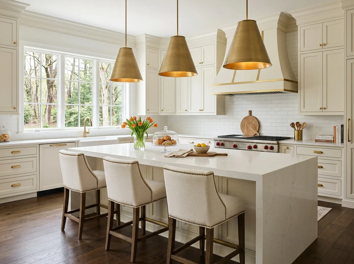
1. Cream Cabinets, Butcher Block, Brass
The warmest classic: cream or warm-white shaker cabinets, a butcher-block or honey-oak worktop, warm-white walls, and unlacquered brass hardware. Wood and brass do the warming; the cream stays light and timeless. It's the safe, never-wrong warm neutral kitchen that suits almost any house.
2. Mushroom Taupe and Marble
Mushroom-taupe cabinets — the quiet-luxury neutral — with a warm-veined marble or quartz worktop, cream walls, and aged-brass fittings. The taupe reads expensive and calm; the marble lifts it. A sophisticated, grown-up neutral that photographs beautifully and doesn't shout.
3. Warm White and Oak
A fully warm-white kitchen lifted by oak — oak open shelves, an oak island, oak floors — with cream walls and brass. The wood is the whole warmth, the white the canvas. Light, airy, and Scandinavian-leaning, it relies on the grain of the wood to keep it from reading clinical.
4. Greige and Honey Wood
A warm greige on the cabinets, honey-toned wood worktops and floors, cream walls, and brass. The greige bridges warm and neutral, the honey wood pushes it warm. It's the most forgiving warm-neutral scheme, reading calm and grounded in almost any light without ever tipping cold.
5. Two-Tone: Cream Top, Wood Bottom
A two-tone kitchen with cream or warm-white upper cabinets and natural wood lower cabinets keeps the room light up high and grounds it with warmth below. It's a current, characterful way to use a warm neutral, and the wood base reads cosier than an all-painted scheme. Brass ties the two tones together.
6. Putty and Brass
Soft putty-coloured cabinets — a warm grey-beige with depth — against cream walls, a warm stone worktop, and brass. Putty reads more interesting than plain cream but stays firmly neutral and calm. A subtle, sophisticated choice for a kitchen that wants quiet character.
7. Warm White With a Terracotta Floor
Keep the cabinets and walls warm white and bring the colour and warmth from the floor — a terracotta tile, a warm clay quarry tile, or a honey wood. The floor grounds the light scheme in earthy warmth and reads timeless and characterful. The warmth rising from underfoot is the whole trick.
8. Oat and Cane
Oat or pale-sand cabinets with cane-fronted detailing, cream walls, butcher block, and brass — a relaxed, textural warm neutral with a touch of the natural and handmade. The cane brings pattern and warmth without colour. A gentle, characterful scheme for a relaxed kitchen.
9. Cream With a Warm Wood Island
Keep the perimeter cabinets cream and make the island a warm natural wood — a walnut or oak block that becomes the room's warm heart. The contrast grounds the kitchen and gives it a focal point. The wood island is the single most effective way to warm an otherwise pale kitchen.
10. Soft Clay and Cream
A soft clay or warm-blush cabinet — barely-there colour that reads as a warm neutral — with cream walls, warm wood, and brass. It's the warmest neutral that isn't quite white, glowing gently in low light. A subtle way to bring colour into a kitchen while keeping it firmly calm and neutral.
11. Match the Worktop Undertone to the Cabinets
Whatever the cabinet colour, the worktop has to share its undertone or the scheme fights itself. Warm cream cabinets want a warm-veined stone or wood, not a cool grey quartz. Pull a warm worktop and warm cabinets together and the kitchen reads cohesive; mismatch the undertones and even a neutral kitchen looks off.
12. Add Brass, Not Chrome
The metal finish makes or breaks a warm neutral kitchen. Unlacquered or aged brass, or warm bronze, reinforces the warmth; chrome and cool stainless fight it and pull the whole scheme cold. Swapping the hardware and tap to brass is the cheapest, highest-impact way to warm a neutral kitchen.
13. Warm the Light to See the True Colour
A warm neutral kitchen lit by cool-white bulbs will read grey and clinical no matter how warm the paint. Fit 2700K bulbs throughout, add a lamp on the worktop, and the cream, taupe, and wood tones come alive. Test the palette under the bulbs you'll actually use — the showroom's lighting is not your kitchen's.
The Method Behind a Warm Neutral Kitchen
The palettes above are the menu; the principles below are the structure — the cabinet colour decision, matching undertones to worktops, and the metal and wood choices that keep a neutral kitchen from reading flat.
The Cabinet Colour Decision
The cabinet colour is the largest single visual element in any kitchen. The warm-neutral options that consistently work:
Warm whites for cabinets. The most flexible choice. Cabinets in a warm white (Farrow & Ball School House White, Slipper Satin, or Pointing; Benjamin Moore White Dove or Simply White; Sherwin-Williams Alabaster) read clean without going clinical. Walls can match for full continuity or shift slightly warmer.
Warm putty or stone tones. Mid-toned warm neutrals that read more substantial than white. Farrow & Ball Hardwick White (despite the name, a warm putty), Skimming Stone, or Stony Ground. Little Greene Slaked Lime. These hold up better than cool greys and don't date as fast.
Mushroom or warm beige. Slightly darker than putty, with more visible warmth. Farrow & Ball Mole's Breath, Light Gray (with brown undertone), or Mizzle. These work particularly well in larger kitchens or kitchens with abundant natural light.
Warm muted greens. A modern cosy classic. Farrow & Ball Mizzle, Bancha, or Lichen for lighter greens; Studio Green or Calke Green for deeper drenched versions on lower cabinets. The green needs to be warm (mossy, olive, sage) rather than cool (mint, true green, teal).
Deep moss for lower cabinets only. A two-tone approach where lower cabinets are deep moss (Farrow & Ball Studio Green, Benjamin Moore Sherwood Green) and uppers are white or warm cream. The contrast reads modern; the warm undertone keeps it cosy.
Deep terracotta or warm clay for lower cabinets. Sherwin-Williams Cavern Clay, Farrow & Ball Loggia, or any rust-toned earth colour for lower cabinets only. Cosy and increasingly current. Best in larger kitchens.
Warm wood cabinets natural. Oak, walnut, or cherry cabinets with a natural finish (oil or matte lacquer) outperform painted cabinets for cosy in many kitchens. The wood grain is the colour.
The Wall Colour
Wall colour in a kitchen is usually less consequential than the cabinet colour because the walls are largely covered by cabinets, backsplash, and appliances. The visible wall sections want to support the cabinets rather than compete.
The rule: walls slightly warmer than the cabinets, or matching the cabinets.
For warm-white cabinets, walls in a warmer cream (Joa's White, Slipper Satin, White Dove). For putty or mushroom cabinets, walls in a warmer pale (Slipper Satin or School House White). For deep-green or terracotta cabinets, walls in a soft warm white (Slipper Satin or Wevet) so the cabinet drama isn't overwhelmed.
Avoid: cool grey or blue walls in any kitchen. They fight whatever warm cabinet colour you've chosen.
The Two-Tone Kitchen
The two-tone kitchen — different colours for upper and lower cabinets — is currently the strongest move in cosy kitchen palettes. Two configurations:
Light uppers, dark lowers. Warm-white or cream upper cabinets, deep-green or terracotta lower cabinets. Anchors the lower portion of the kitchen visually and lets the upper portion feel airier.
Wood uppers, painted lowers. Open wooden shelving (oak, walnut, ash) for upper storage with painted lower cabinets in warm putty or green. Reads as cottage-modern; ages beautifully.
Painted uppers, painted lowers in same hue but different finish. Same colour family but lighter on top, deeper on bottom. Subtle but sophisticated.
Skip: two-tone palettes with cold contrast (cool grey lowers, white uppers) — they read like real estate listings rather than homes.
Wood and Stone as Warmth Sources
Material warmth often does more than paint colour. Three sources matter:
Wood worktops or sections. A butcher-block worktop section in oak, walnut, or maple. £150-500 for a section depending on size. The visible grain warms the kitchen more than any cool stone or quartz alternative.
Stone with movement. Marble, soapstone, or breccia with visible veining and natural variation. Quartz with veining isn't the same — the synthetic veining lacks the depth of real stone. £400-2,000 for a small section depending on type.
Wood open shelving. A wall of wooden open shelving (oak or walnut) instead of upper cabinets does as much for warmth as any paint colour choice. Even one or two wooden shelves added to a painted-cabinet kitchen shifts the palette.
Backsplash in handmade or warm-toned tile. Zellige tile, hand-made terracotta tile, warm-toned ceramic. The variation in the tile's surface and slight irregularity reads warmer than machine-cut subway tile.
Hardware as Colour
Cabinet hardware is part of the kitchen's colour palette. The cosy choices:
- Unlacquered brass (ages to deep amber)
- Aged brass with darkened finish
- Solid brass with brushed finish
- Hand-forged iron
- Wooden knobs
Skip: chrome, polished nickel, brushed nickel in glossy finishes. They cool down warm kitchens regardless of the paint.
A whole-kitchen hardware swap from chrome to brass costs £80-300 and shifts the entire warmth of the palette without changing paint.
Specific Working Palettes
Below are six working warm-neutral palettes that have aged well across multiple kitchens and clients.
Palette 1: Warm white minimal
- Lower cabinets: Farrow & Ball Slipper Satin
- Upper cabinets: same as lower (or open oak shelving)
- Walls: Farrow & Ball Pointing or Slipper Satin
- Hardware: unlacquered brass
- Worktops: warm-veined marble or oak butcher block
Palette 2: Mushroom and warm white
- Lower cabinets: Farrow & Ball Mole's Breath or Hardwick White
- Upper cabinets: warm white (Slipper Satin)
- Walls: Slipper Satin
- Hardware: aged brass
- Worktops: dark soapstone or warm walnut butcher block
Palette 3: Sage green and cream
- Lower cabinets: Farrow & Ball Mizzle, Bancha, or Lichen
- Upper cabinets: Slipper Satin, or open oak shelving
- Walls: Slipper Satin or Joa's White
- Hardware: brass
- Worktops: warm-veined marble or oak butcher block
Palette 4: Deep moss drenched
- Both upper and lower cabinets: Farrow & Ball Studio Green or Sherwood Green
- Walls: Slipper Satin (visible portions)
- Hardware: aged brass
- Worktops: warm-toned stone or oak butcher block
Palette 5: Terracotta and warm cream
- Lower cabinets: Sherwin-Williams Cavern Clay or Farrow & Ball Loggia
- Upper cabinets: open oak shelving
- Walls: Slipper Satin or Joa's White
- Hardware: unlacquered brass
- Worktops: warm marble or oak
Palette 6: Natural wood and warm white
- Both upper and lower cabinets: oak, walnut, or cherry in natural finish
- Walls: Slipper Satin or School House White
- Hardware: matched timber or brass
- Worktops: warm stone or oak butcher block
Each palette is starting point. The specific paint choices within each palette can vary based on orientation and existing fixed elements (worktops, floors, appliances).
The warm-neutral kitchen palette ages better than the trend palette. A trend kitchen reads contemporary for two years and dated for the next twenty.
What to Skip in Kitchen Palettes
Cool white cabinets in cool grey walls. The default modern kitchen palette and one of the most ageing combinations. Reads as builder-beige even when it's not technically beige.
High-contrast black and white. A kitchen with black cabinets and white walls reads as architectural studio rather than as a room. Ages faster than warmer palettes.
Cool blue cabinets. Even "trendy" cool blues like navy or slate read flat and clinical. Warm muted greens or muted blues (Farrow & Ball Inchyra Blue, which has warm undertones) work better.
Yellow cabinets in any saturation. The 1990s buttercream kitchen aged badly and yellow-toned cabinets continue to age fast.
Bright primary colours. Red, bright blue, bright green. They date instantly.
Greige (grey-beige). The 2010s "neutral" that reads as builder-grade. Warmer pinks, mushrooms, and putty colours read more sophisticated and date less.